In 1993 I had a second hand Mac Plus and a 230 Meg hard drive...
(Lights pipe) Things were better in those days... the milk came in udders and you could lick the sweat off the top, there were floggings in the market place, and you could spend hours playing with primitive graphics applications like MacDraw and the built-in editors in Hypercard. On a monochrome screen like the MacPlus had, and within it's maximum memory of about 4 Meg, we tended to keep the files small and bitmapped. There was still a lot of room for movement.I'd already experimented with bitmapped graphics via the medium of quilts. In 1991 I had a stall at Glebe Markets in Sydney selling doona covers I knocked up quickly using second hand neckties. It was a living, of sorts... there was little else available at the time for work.

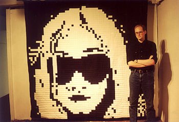
 After I packed that in and moved into the warehouse, I kept my hand in with the occasional experiment. One experiment was a quilt with the bitmapped face of Kim Gordon from Sonic Youth on it. I created that image by sketching her, from the cover of their Dirty album, onto a piece of graph paper. Any squares that had prominent lines across them, I filled in. Any which were empty I left white. A few generations of paper and a lot of tinkering produced an image I liked, and I made the quilt out of black and white cotton.
About this time I painted an enormous visage of "The Boss" for our group exhibition "Not Art". It hung in the two-storey-high loading dock of the warehouse, looking down on anyone who came in. The original of this was a photo of Robert Menzies, a former prime minister of Australia noted both for his extreme conservatism and for the length of his reign. After the exhibition finished we hung him from the pedestrian bridge over Parramatta Rd. so the motorists could see him. It was the morning after an election too...
With the computer the process was a lot faster. As soon as I learned the rudiments of the Mac I started putting together more faces, sketching with the mouse from photocopies and images in books and the paper. It made the process a lot faster to be able to punch pixels in and out as I wished. When I bought my Mac II and scanner it opened up new possibilities. I could scan images myself, then play with the brightness and contrast in Photoshop to produce more realistic faces.

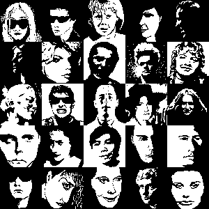
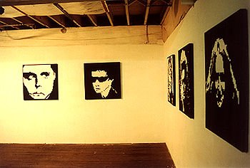
In 1992 / 93 I painted a series of 25 faces on panels from inside office partitions, about 2 1/2 by 2 1/2 foot each, using matt black and gloss white paint and a special masking technique to get the lines straight. They were hung in the main gallery of the warehouse, spaced evenly around the walls in a row. It was the only solo exhibition in that gallery. Click the above map for closeups of the images, here for the catalog.
The thing I loved about these images was the amount of expression they had. Somehow the process of reducing the hell out of a human face brought out new nuances of emotion and truth about the people. To make the faces easily recognisable I had to work only with faces that had strong shadow effects, and this and the starkness of black and white made them strong and moody. They seemed to gain something from the loss of the detail, as though detail was something that clouded and distorted the truth.
 |
 |
 |
 |
 |
 |
 |
|
 |
 |
 |
|||||
 |
 |
||||||
 |
 |
||||||
 |
 |
||||||
 |
 |
||||||
 |
 |
||||||
 |
 |
 |
 |
 |
 |
 |
|


